Building a bookmark manager browser app to learn the full design-to-deployment cycle and test how coding agents expand what designers can ship.
One of my dreams as an early designer was to ship a line of code to a production app. It felt nearly impossible at the time - I wasn't comfortable with testing environments, code setup, or half the terminology developers used daily. With coding agents, that changed.
This project is my personal experiment: What happens when a designer codes? At work, I use AI agents regularly for 0-1 explorations and prototyping. But this time, I wanted to understand the whole setup - backend, databases, environments, deployments.
So I set out to build Mindmark, a bookmark manager that would solve a real problem: I had 355 bookmarks saved in Chrome, and I couldn't find any of them.

Iterating on the "Add Bookmark" interaction in code
Mindmark is a bookmark manager browser app that combines natural language search with manual organization. You can search using context ("React tutorials"), or browse by Spaces (user-created collections).
Core features:
- Semantic + keyword search – built with the Xenova/all-mpnet-base-v2 embeddings model
- Bookmarks import - add manually or import via an HTML file.
- Spaces – manual bookmark collections.
Tools I used:
- Cursor (coding agent)
- Vercel (hosting + Neon Postgres database)
- Figma MCP server (design context for the agent)
- Figma (visual design)
- GitHub (version control)
I started by skipping Figma and prototyping directly in code. This let me iterate on functionality fast and focus on how the experience felt, not just how it looked on static screens. My initial prompt was simple: “Build a browser-based bookmark manager...”, just enough to give a high-level context to the model.
Since search was the core of the experience, I tackled that first. I combined semantic search for contextual understanding with keyword search for precision - weighting results 70% semantic and 30% keyword. This balance let the app prioritize intent while still catching exact matches like “GitHub” or “Figma.”

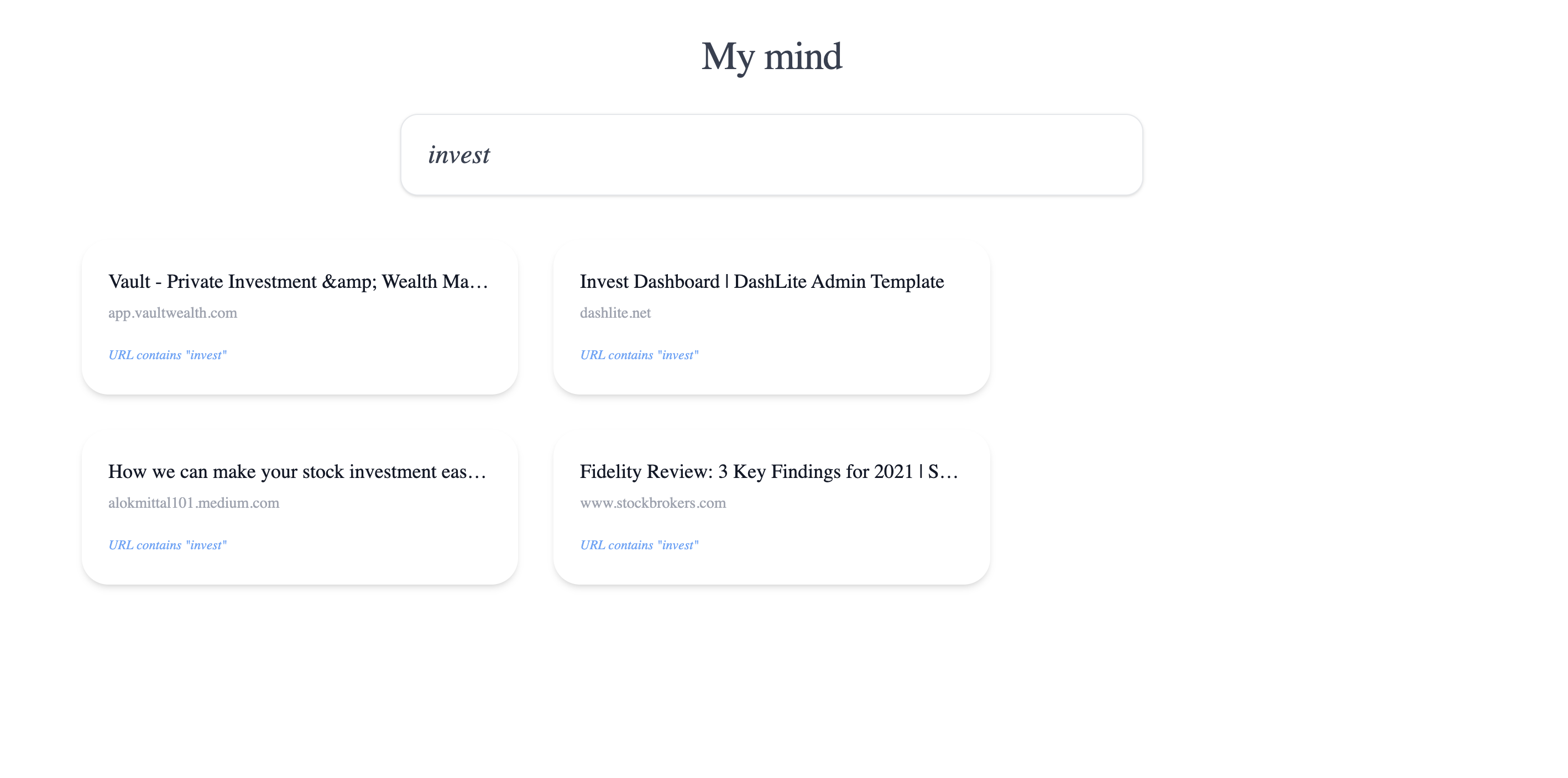
Early functional prototype — testing how search and categories work
My initial design had filters under the search bar to browse bookmarks by category - Books, UX/UI, Finance, Stocks, Programming, and so on. These were hard-coded based on the original bookmark groups I imported.
Soon I realized the problem. The system struggled to categorize bookmarks consistently. For example, I had both “Stocks” and “Finance,” and a bookmark like “Arta Invest” ended up in Finance. From a user’s perspective, that distinction felt arbitrary and confusing. And with semantic search now, the UX naturally shifted toward finding links quickly rather than browsing between categories.
So I removed categories from the search experience entirely. The new version was cleaner and more focused - just a search bar and results.

Simplified UI — removing categories helped focus on finding, not browsing
Text and URLs alone felt flat - I wanted each bookmark to convey meaning at a glance with visuals. I discovered that browsers provide 3 primary ways to surface visual cues:
- Open Graph images - 1200×630px, built for social sharing
- Twitter Card images - similar size, same intent
- Favicons - tiny icons, 16×16 - 512×512px
Since I wanted my bookmark cards to have a 4:3 aspect ratio, Open Graph images were the natural choice.

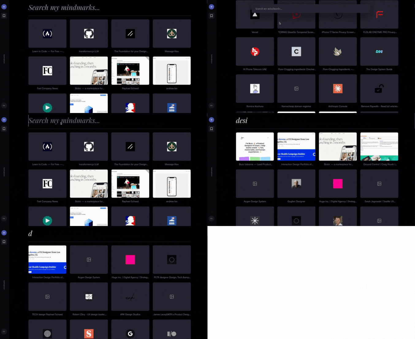
Open Graph images with favicon fallbacks made bookmarks easier to scan and recognise
But fetching these in real time, however, became a bottleneck: 355 API calls on every page load slowed the UI, triggered rate limits, and simply wouldn’t scale. So I found the solution in a layered caching strategy:
- Load the Open Graph image (cached locally, then from Vercel DB)
- If missing, fetch the Clearbit logo (free and unlimited)
- If that fails, grab the Google favicon
- Finally, show a placeholder icon, our ever-reliable friend in edge cases 🤓
Once the core functionality worked, I jumped into Figma to create a style guide and components. I wanted a monochromatic indigo system - purples and cool grays, inspired by Linear.

Creating a basic library with colors, typography, and components for a more polished UI
With Figma MCP server, the coding agent could read my design tokens, states, and layouts more accurately. One prompt got Cursor close to the original design, and a second prompt refined the UI to match perfectly.

Add bookmarks modal: from Figma design (left) to working code (right) in one prompt. Not bad at all 😀
MY LEARNING
Vibe-coding gets you to V0 fast, Figma gets you to V1. You can prototype interactions quickly in code, but for consistency and polish, vector-based tools still work the best.
But it wasn’t without challenges. The AI server kept breaking - search would freeze, fall back to keyword-only mode, or stop working entirely. If I were a developer, I’d have debugged it faster. Instead, it took several rounds of trial and error to get things running smoothly.
Pro tip: checking the actual logs in Terminal and asking the model to help analyze them saved me hours. Worth trying if you’re building something similar.

Making semantic search work was painful - and gave me real respect for what developers deal with daily
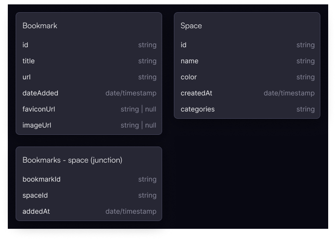
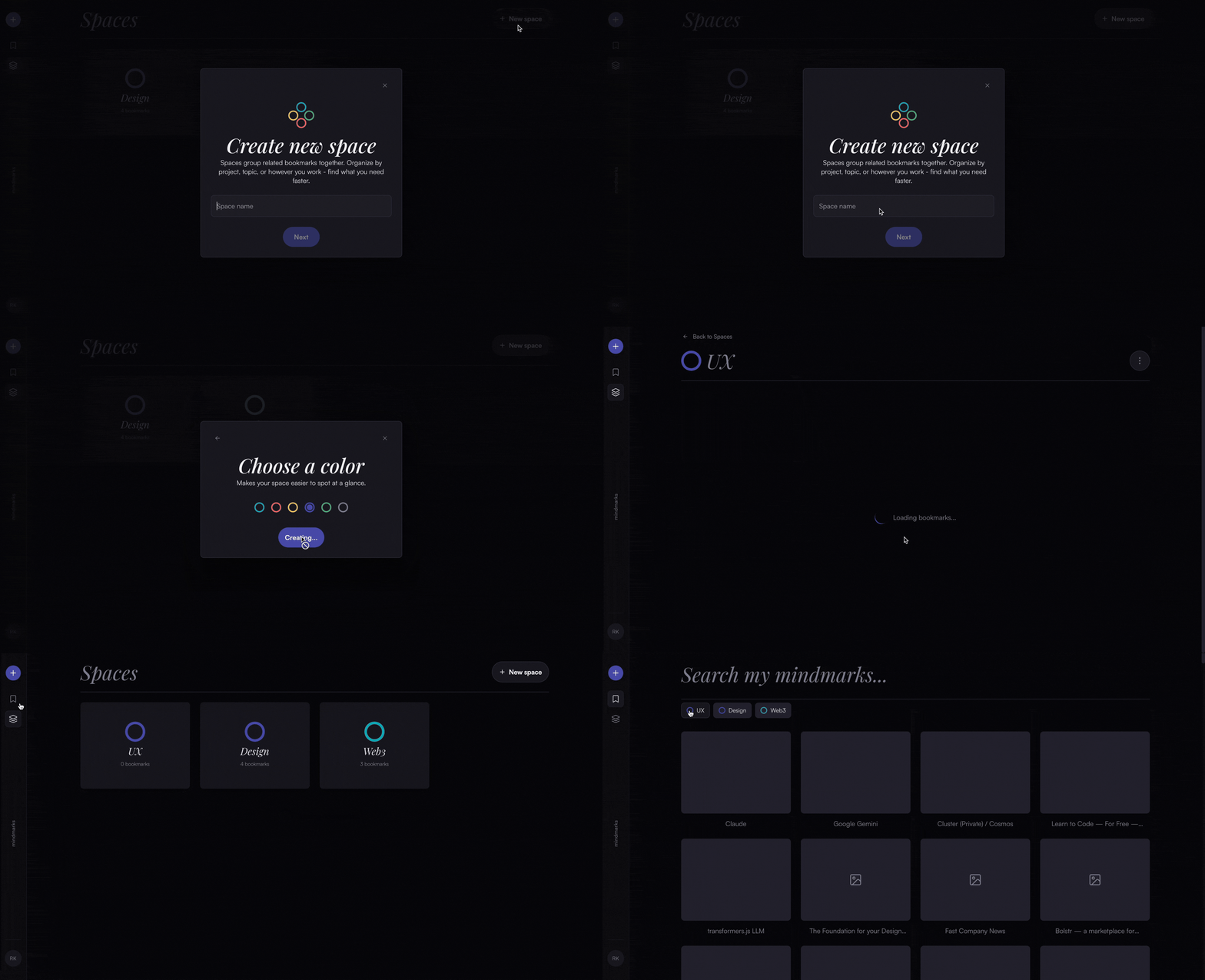
I found that giving users control over organization works better than auto-assigned tags or categories. So I built Spaces - manual collections like "Web3", "Learning", or "Side Projects". You decide what goes where. Familiar and intuitive, no reinventing the wheel.

Spaces in action!
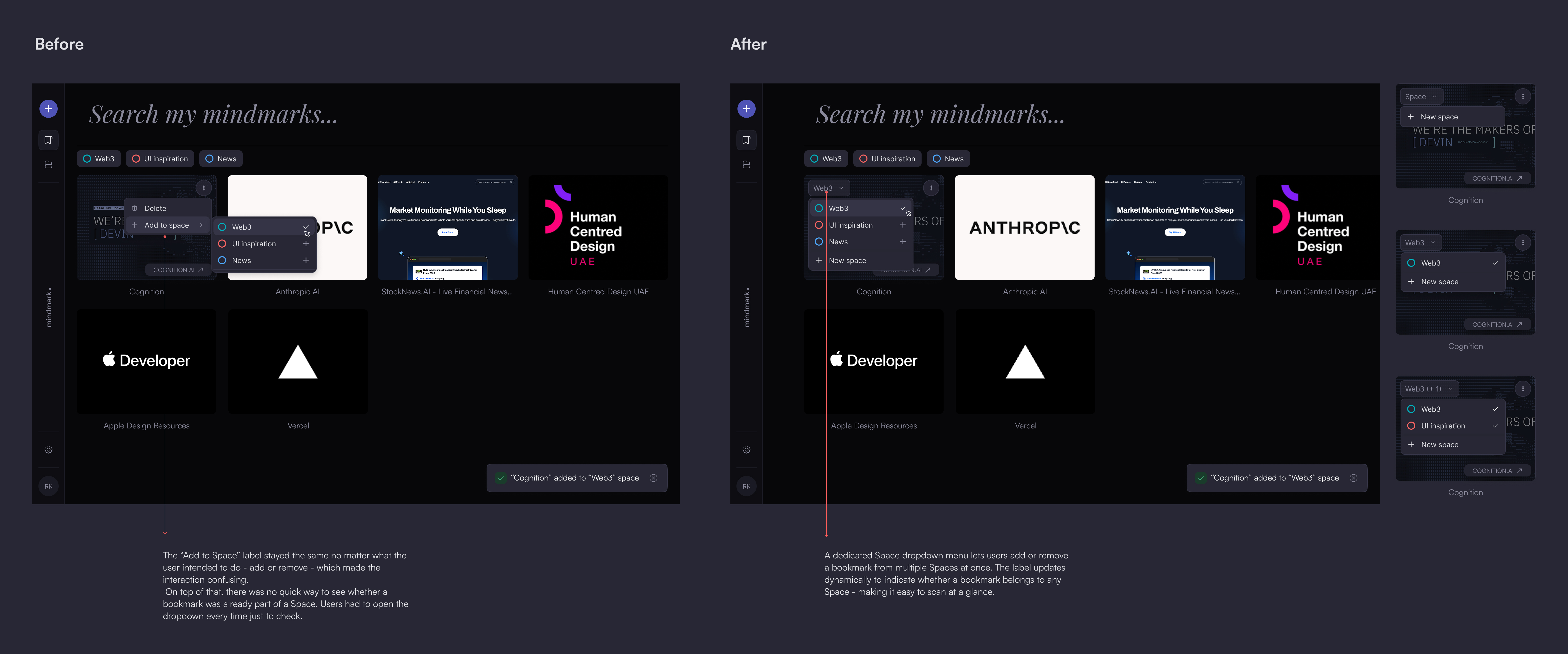
In the first version, adding a bookmark to a Space happened through a hover dropdown - click “Add to Space”, then pick from a list. But once inside a Space, the same control changed to “Remove from Space.” 2 different interactions for the same action - confusing and inconsistent.
So I decided to replace it with a menu that lists all available Spaces. This allows adding or removing a bookmark from multiple Spaces at once. It’s also easy to see which Spaces a bookmark belongs to, since the dropdown label updates dynamically to reflect its state:
- 0 spaces: “Space”
- 1 space: “Web3”
- 2+ spaces: “Web3 + 2”
MY LEARNING
This was a good reminder that when vibe-coding directly in the browser, it’s easy to miss inconsistencies. Figma, by contrast, forces you to see how patterns hold up across states and contexts.

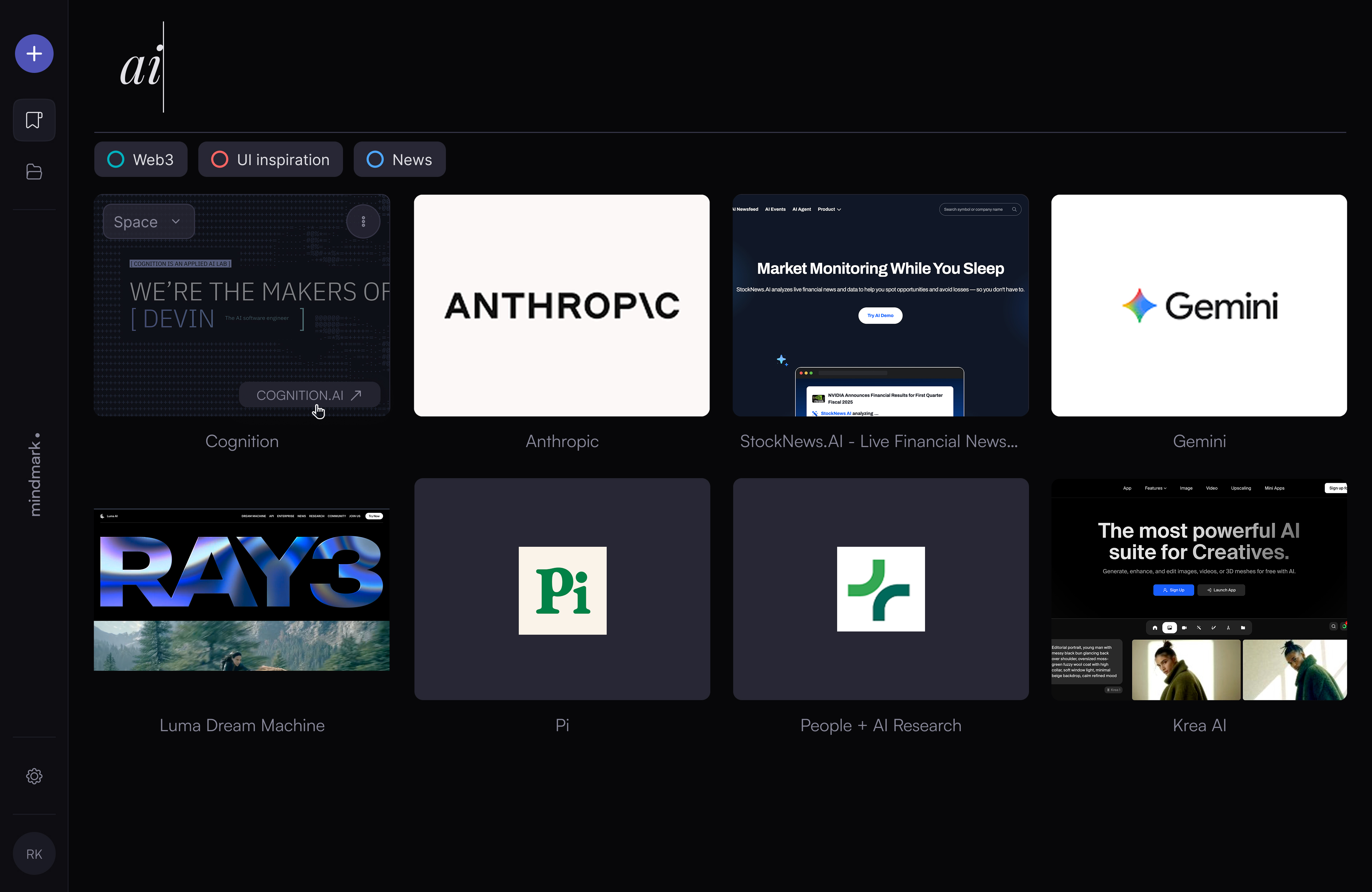
2 weeks results - searching for bookmarks is now a more engaging experience
Software dev skills are valuable - but humbling
It was great to be a developer for a few weeks. But while AI tools give me access and basic understanding, I spent hours trying to solve issues a developer would fix in minutes. It gave me even more appreciation for what software engineers do.
Prompting strategy matters
When you start building, there's a lot to bring to life. Your prompting strategy determines whether you have a good time or a bad time. I learned to wear a PM hat: break things into scope, decide what to build first, and tackle features one at a time. Spaces first? Or the ability to add links directly? Think in chunks.
Workflow discovery: code → Figma → code
Prototype in code to test interactions quickly. Jump to Figma to refine UI, build a design system, and ensure consistency. Return to Cursor with design context. This loop is fast, effective, and something I can use at work.
Building is addictive
The feedback loop is immediate. Change something, refresh, see it work (or break). Hard to stop. I'd find myself up late fixing bugs or tweaking the UI. That immediacy makes you appreciate how much goes into shipping software.
AI agents get cognitive overload too
Dump too much context at once, and everything breaks. The UI gets messed up, the agent hallucinates features, and you're back to square one. Work in small chunks, just like humans do.
It's thrilling to be in this era of AI development. Design tools and dev tools are coming together, bridging the gap. As a designer with no dev background, I can now do 0-1 explorations faster and build in code - prototyping new features in the context of the product without needing an engineer by my side. This project taught me that curiosity matters. You don't need to be a senior engineer to ship something real. You just need to start, stay patient with the learning curve, and embrace the messy parts.
What's next: I'm building a auth layer and browser extension so you can save bookmarks directly from any page. Also exploring collaborative Spaces - bookmark collections you can share with others.


